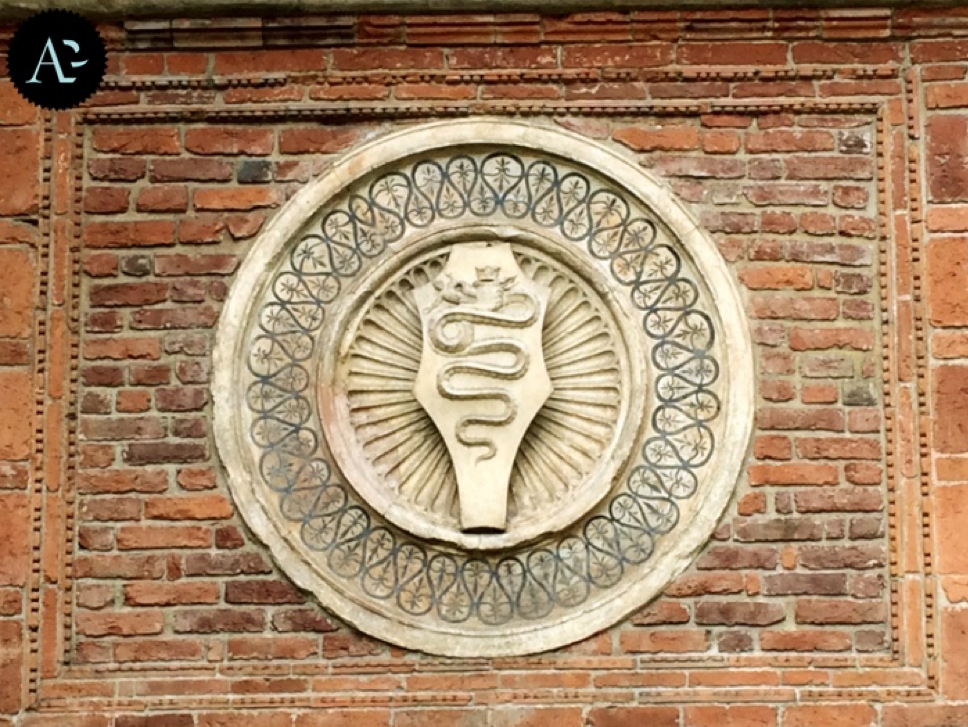
 The emblem of the Visconti is the symbol of Milan The Biscione ('large grass snake'), also known as the Vipera (‘viper’ or in Milanese as the Bissa), is a heraldic charge showing a blue serpent in the act of swallowing a human – usually a child, and sometimes described as a Moor. It has been the emblem of the Italian Visconti family for around a thousand years. According to the legend, in the 1100s, Ottone Visconti, during the Second Crusade, led an army of Milanese citizens in the siege of Jerusalem, and challenged the cruel Saracen Voluce to a duel. Voluce’s coat of arms was a snake devouring a man. Ottone killed the Saracen, took his weapons and his symbol and brought it to Milan and decided to adopt the warrior’s coat of arm as his own. The symbol of the House of Visconti was born and, when the Visconti family gained control of Milan, the biscione became the symbol of the city. The man eaten by the snake was replaced by a red Saracen and later became a child, with the aim of showing the goodness of the Visconti’s snake. House of Visconti 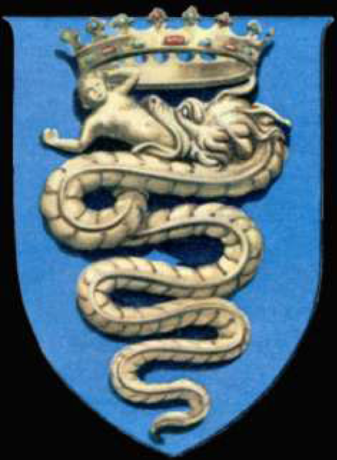 Coat of Arms of the Visconti of Milan depicting the biscione, a serpent who appears to be swallowing a human, but is actually giving birth to it. Later, the biscione appears in the coats of arms of the House of Sforza, Milan, the historical Duchy of Milan and Insubria. It is also used as a symbol or logo by the Italian football (or soccer, for my American readers) club Inter Milan, and in a version where a flower replaces the child, by Fininvest, as well as the Italian automobile manufacturer, Alfa Romeo and the logo of the private Italian TV network, Canale 5 – Mediaset (Channel 5). The biscione as a symbol of Milan in the Castello Sforzesco 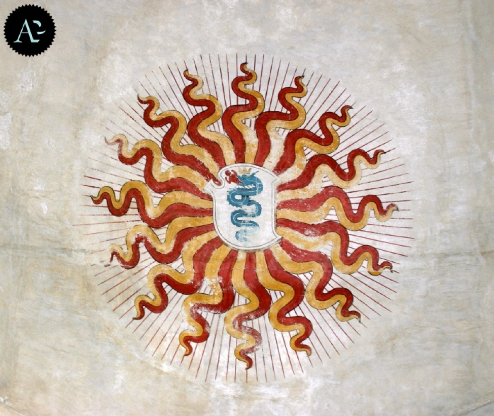 The Castello Sforzesco was built in the 15th century by Francesco Sforza, Duke of Milan, who ruled Milan after the Visconti dynasty, on the remnants of a 14th-century castle, originally the residence of the Visconti family. Historical Origins Images of the biscione are found throughout history in different civilizations. One of the most notable is in the representation of the Aztec god, Quetzalcoatl. Notwithstanding the similarities of these two images, since Visconti adopted the Biscione in the 1200s, and the Europeans did not meet the Aztecs until much later, it is very doubtful that the Aztec serpent had any influence on the origin of the Italian Biscione. Quetzalcoatl 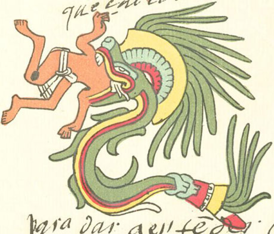 Quetzalcoatl depicted as a snake devouring a man, from the Codex Telleriano-Remensis, one of the finest surviving examples of Aztec manuscript painting. 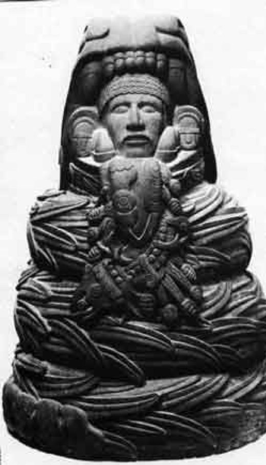 Quetzalcoatl, the Aztec "Lord of Life" and King of Tula being 'consumed' by a 'serpent' The Biscione in Modern Times Inter Milan Biscione 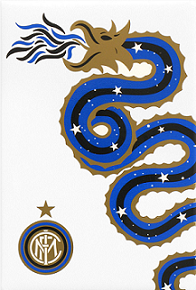 The Italian football (soccer) club, F.C. Internazionale Milano, used the biscione on their old jerseys and emblems, but it depicted the snake breathing fire, instead of eating a man. Silvio Berlusconi's Biscione 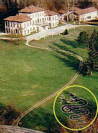 Italian (Illuminati) Former Prime Minister Silvio Berlusconi's Residence with a Crowned Reptile (Biscione) Eating a Human depicted on the Lawn. Alfa Romeo Emblem 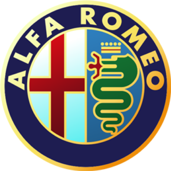 The Logo Contains the Biscione and the Flag or Coat-of-arms of Milan. For more information on this logo, please click this link: Canale 5 – Mediaset, Milano Logo  The Biscione – found at the Grazzano Visconti (Province of Piacenza) near Milan 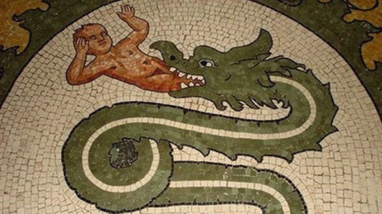 This is a beautiful mosaic of the Biscione found in the small city of Grazzano Visconti located in the province of Piacenza, near Milan. 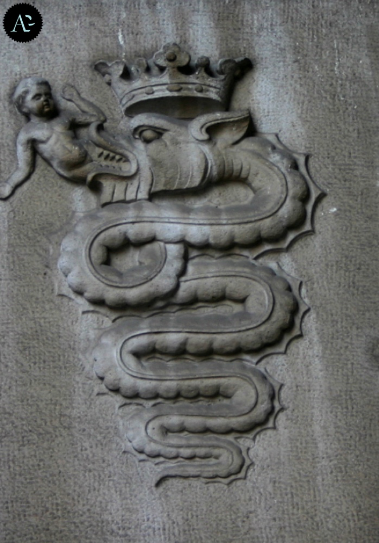 The biscione as a symbol of Milan in the Central Station. 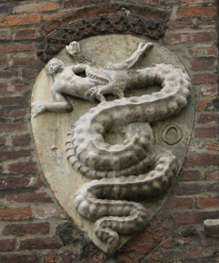 The biscione on the Archbishop's palace in Piazza Duomo in Milan
9 Comments
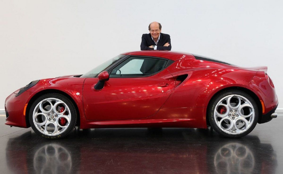 Lorenzo Ramaciotti Standing Behind His Artwork - the Alfa Romeo 4C While I was doing some research on the topic for my next blog entry about the Alfa Romeo 4C, I found – almost serendipitously – three articles on Lorenzo Ramaciotti. He is arguably the greatest car designer, still busily putting pen to paper. Ramaciotti started his career at Pininfarina in 1972 and stayed with the design house for over 30 years. He was its design director for the last two decades. In that time, he personally designed some of the most beautiful cars of recent years, including the Ferrari 456, 360 Modena, F430, 550 Maranello, the Enzo Ferrari, 612 Scaglietti and the very popular Peugeot 406 Coupe. After retiring from Pininfarina in 2005, Ramaciotti was coaxed out of retirement to head global design for Fiat-Chrysler, where he’s overseen (among others) the Maserati GT, the Maserati Quatropporte, the Alfa Romeo 2010 Giuletta and the beautiful Alfa Romeo 4C.
All in all, he has been responsible for more than 30 production cars and 25 concept cars like the 1989 Ferrari Mythos and the 2005 Maserati Birdcage. Looking at those objects of art, Sam Phillips’ question resonates in my ears: “Why is it that despite the dramatic increase in computing 3D design and production techniques, present-day car designers seem to struggle to create cars as beautiful as those simple, elegant post-war classics that epitomize the approach of Italian design – “proportions, simplicity and balance”. I hope you enjoy these three articles. Dear Alfa Romeo followers, and ALL car enthusiasts in general, My father has just purchased a piece of automobile history! He has just bought himself the latest Alfa Romeo 4C Coupe. With its iconic lines, progressive technology and extraordinary performance, the car speaks VOLUMES to the work that Alfa Romeo has done over the past decades! 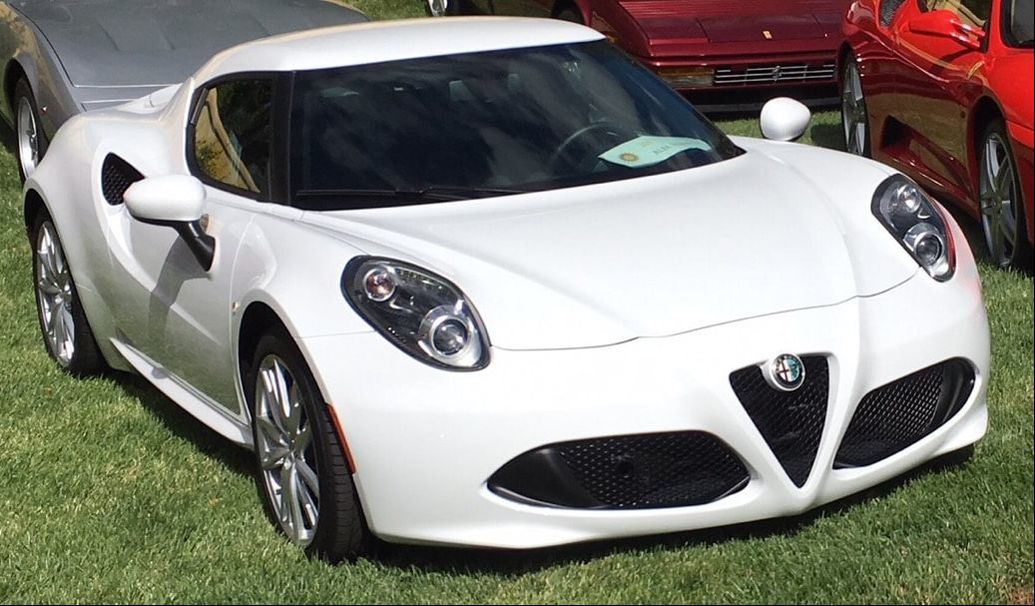 I am an up-and-coming car enthusiast, and became fascinated by the beautiful badge of the car. That led me to search the history of the Alfa Romeo emblem. Here, I would like to share a tl;dr version of what I found for those interested in learning about the history of the Alfa Romeo emblem.
1920: In 1915, Nicola Romeo took over A.L.F.A. and the car manufacturer became Alfa Romeo. The new logo was modified to read “Alfa-Romeo” on the top half and “Milano” on the bottom half. 1925: A crown of golden laurel was added around the emblem, marking the victory of the Alfa-Romeo at the first Automobile World Championship. 1946: During World War II, the factory was heavily bombed, and the machines which produced the iconic Alfa-Romeo badge were destroyed, leading to a simplified, single-color (red) variant of the badge, with a thinner band of laurel. 1950: As the republic proclaimed sovereignty, the Savoy dynasty knots were replaced by two wavy lines, and the badge regained its full-color scheme. After World War II, Alfa Romeo became the team to beat in Grand Prix Racing events. Giuseppe Farina won the first Formula One World Championship in 1950 in the Alfetta 158. The next year, Argentinean, Juan Manuel Fangio, became Alfa’s second consecutive F1 champion. 1972: The Alfasud factory opens its doors in Pomigliano D’Arco, near Naples, Italy. With the advent of opening a second factory in Southern Italy, the Alfa logo was once again redesigned. The hyphen was deleted from the name, with no space between the two words. In addition, the removal of “Milano” and the wavy lines signified the spread of the Alfa Romeo effect throughout Italy. The serpent lost its detail (i.e. no more scales or eyes). 1982: The laurel wreath is removed from the emblem and replaced by a thin, golden ring, and the logo’s diameter was increased. Several design elements were modified, simplifying the logo, including a new gold typeface, with the words "Alfa" and "Romeo" gaining the space between. 2015: The newest rendition of the Alfa Romeo badge is a balance between size and shape. Each element has a specific color. The two-color background was removed, and replaced by a modernized background of two different tones of gray, which blend together in a 3-D contrast of light and dark. The raised texture on the background marks the brand’s character. The crown lost some of its spikes and the snake has only 4 coils. Epilogue: This research helped me understand why the 2017 Alfa Romeo 4C carry the 1982 logo. This model was introduced into the market in 2013, two years before Alfa Romeo redesigned its logo to its current rendition. All subsequent years maintain the original logo. The newer cars, such as the Giulia and the Stelvio, carry this new logo. 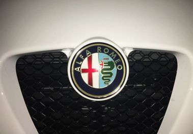 |
John WernlyHello World! I'm new to blogging, and I would like to start out by sharing with you some of my automotive fandom. ArchivesCategories |
 RSS Feed
